As part of the IT team, I developed a couple of proposals to establish the new Visual Identity for the Studio.
These proposals were always very loose in terms of formal development, focusing more on the animation look & feel (cartoony squash & stretch), rather than strict design rules as such. Initially, each member of the team had proposed a couple of versions, however the blocky-cartoony logo with the bouncing ball I presented was the chosen one.
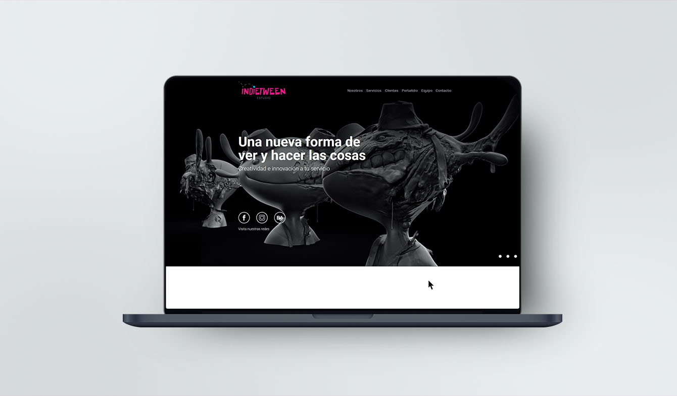
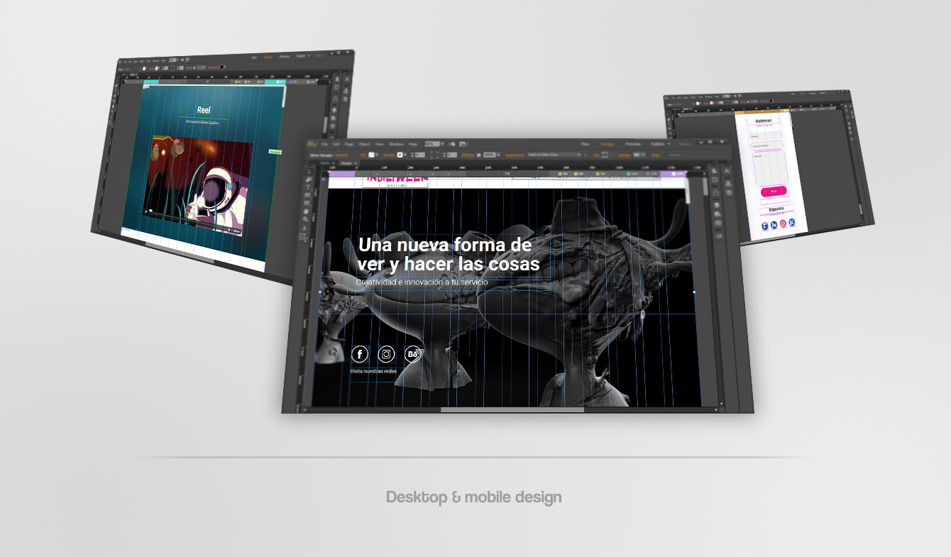
Then I design and program the UI/UX for the website with their respective adaptations for desktop and mobile devices.
Here I show you a little bit of my creative (and a little messy) process.
- Categories:
- Skills:
- Share:
 Previous
 Next
Next
